Slack is a corporate communication collaboration tool that advertises more effective communication between teams, allowing them to focus on their work and avoid interference from email communication. Since its launch in 2013, there have been more than 8 million daily active users, and it has grown at an alarming rate. Our Kitcle team is also using this tool for internal communication, which significantly improved collaboration efficiency.
The old Slack logo, also the first logo, was designed before the company was founded in 2013, and looks like a hashtag (#) symbol.

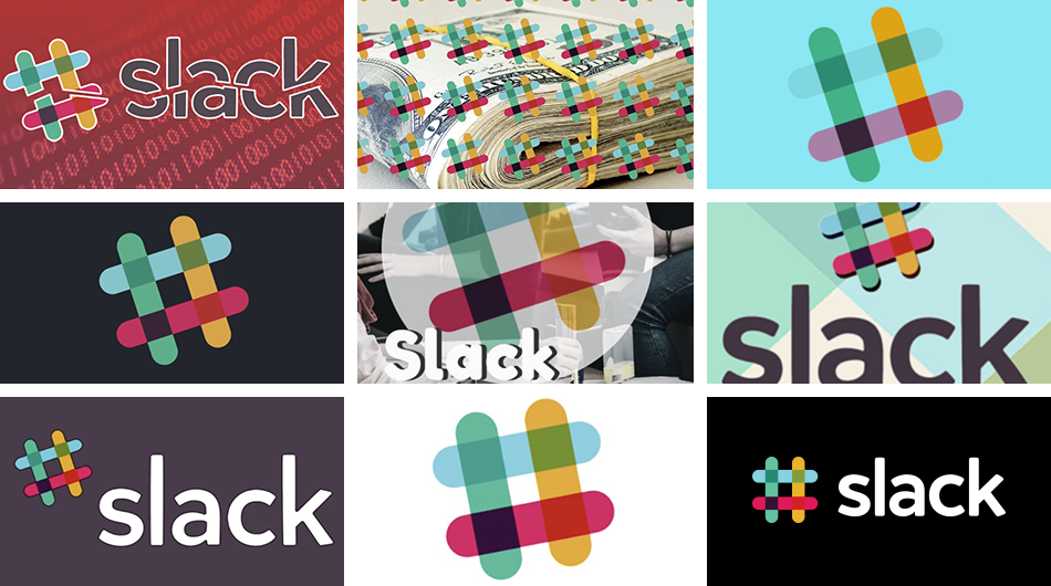
Slack explained the reason for the replacement of the new logo on the official blog. Point out that because the old logo has 11 colors, the image on any color is very poor, and you can hardly see the Slack logo. The situation is as follows, it is very difficult, and even the existence of the Slack logo cannot be found.
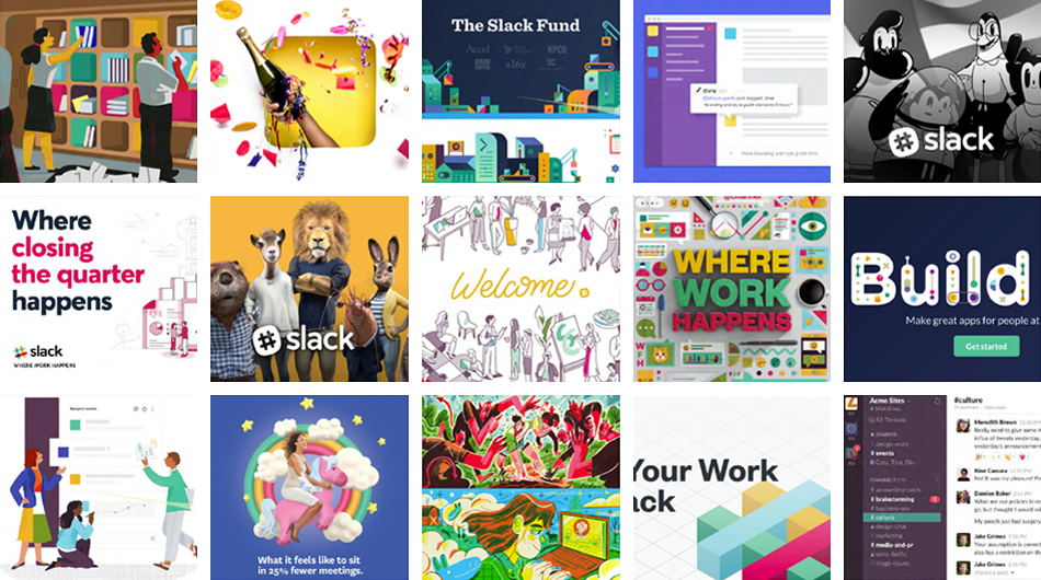
Slack pointed out that putting the logo on any color makes the whole thing very wrong. They hope that the logo is easily recognizable to everyone. Therefore, they redesigned the logo!
Slack believes that the newly designed logo is more refined, simpler than the previous generation, and retains the old spirit. The new logo removes the old overlapping colors and uses the original four colors directly. At the same time, the unique eggplant purple is retained as the main back color.



In addition to the supporters who expressed their preference for new designs, they also provoked criticism from some netizens. Someone unexpectedly came up with the Nazi symbol, and some people saw it as four ducks…

